Tab Layout — Edit Mode
The Layout tab is where you design your touchscreen control surface. It has two modes: Edit (form-based) and JSON (raw import/export).
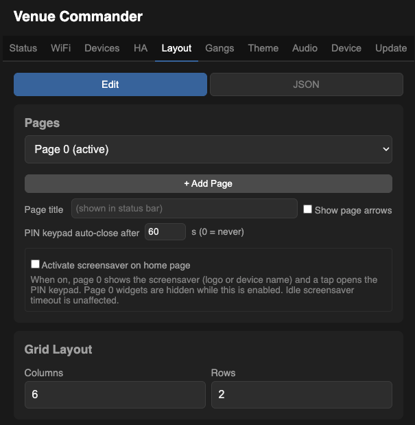
Pages
Venue Commander supports up to 8 pages (numbered 0–7), each with its own grid dimensions, widgets, and optional PIN lock. Page 0 is always public; pages 1–7 can be PIN-locked. Use the dropdown to switch between pages.
| + Add Page | Creates a new blank page. |
| Page title | The name shown in the status bar on the touchscreen. |
| Show page arrows | When checked, < and > navigation arrows appear on the touchscreen status bar for switching pages. |
| Page PIN Lock | Per-page lock with up to 10 PINs and an auto-return timeout. See Page PIN Locks. |
Grid Layout
Set the number of Columns and Rows to define the grid. Widgets are placed at specific column/row positions within this grid. Up to 48 widgets of each type per page (OSC, Shelly, Home Assistant, and gang widgets each have their own pool).
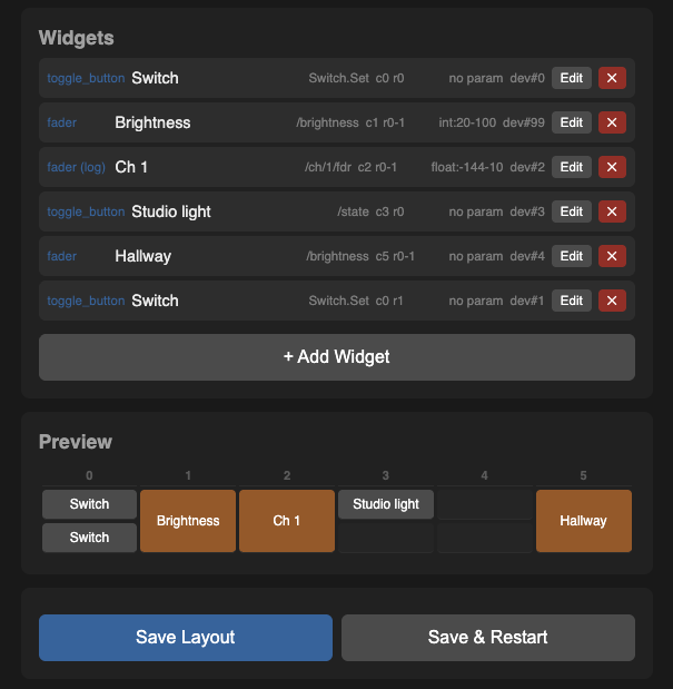
Widgets
Widget Types
Grid sizing per widget type: labels, toggles, buttons, toggle-buttons, info, and gang toggles default to 1 column; faders default to 3 columns. You can override with the column-span and row-span fields.
Adding a Widget
Click + Add Widget to open the widget editor:
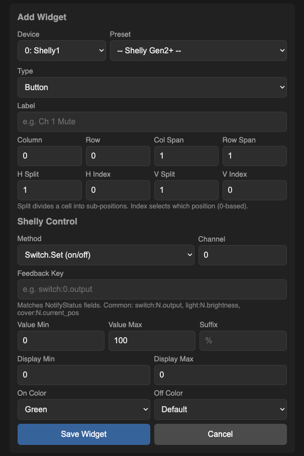
The widget editor adapts its fields based on the type of endpoint you've picked. Common fields are always shown; endpoint-specific fields appear as needed.
Common Widget Fields
| Field | Description |
|---|---|
| Widget Preset | Quick-fill from device-specific presets. Available presets are filtered by the type of device the endpoint points at — a Wing endpoint shows Wing presets, a Shelly endpoint shows Shelly Switch/Dimmer/Cover presets, and so on. Some presets prompt you for a channel number. |
| Type | The widget type (see cards above). |
| Endpoint | Which endpoint this widget sends to. The optional audio board appears here when it's connected. |
| Label | Display text shown on the widget. |
| Column / Row | Position in the grid (counting from 0). |
| Col Span / Row Span | How many grid cells the widget spans. |
| Orientation | For faders: Vertical or Horizontal. |
| H Split / V Split | Divide one cell into smaller sub-positions. The Index field picks which sub-position this widget sits in. Useful for fitting two toggles side-by-side in one cell. |
OSC Widget Fields
Shown when the selected endpoint is an OSC endpoint:
| Field | Description |
|---|---|
| OSC Address | The OSC path (e.g. /ch/1/mix/fader). |
| OSC Value | Configure the value sent with the OSC message — tick “Send parameter value”, then choose whole-number or decimal, and set the min and max. |
| Display Range | Optional display min/max override and suffix for faders (e.g. show dB values). |
| On Colour | For toggles and toggle buttons: the colour shown when on. Choose from green (default), red, or blue. |
| Off Colour | For toggles and toggle buttons: the colour shown when off. Choose from default (grey), green, red, or blue. Use with On Colour to express ‘on’ vs ‘mute’ meaning — e.g. X32/M32 mutes: green on / red off; Wing mutes: red on / green off. |
Shelly Widget Fields
Shown when the selected endpoint is a Shelly endpoint:
| Field | Description |
|---|---|
| Action | What this widget does on the Shelly device: turn a switch on/off (Switch Set / Toggle), set a light's brightness or colour (Light Set / RGB Set), or move a cover to a position / open / close / stop. |
| Channel | Which channel on the Shelly device (0–3). Most devices use 0 for their first or only switch / light. |
| Feedback Key | The state value to read back from the Shelly device (e.g. switch:0.output for on/off, light:0.brightness for brightness, cover:0.current_pos for cover position). The preset fills this in for you. |
| Value Min / Max | Value range for fader widgets (e.g. 0–100 for brightness percentage). |
| Suffix | Display suffix (e.g. %, W). |
| On Colour | For toggles and toggle buttons: the colour when on. Choose from green (default), red, or blue. |
| Off Colour | For toggles and toggle buttons: the colour when off. Choose from default (grey), green, red, or blue. |
Home Assistant Widget Fields
Shown when the selected endpoint is a Home Assistant endpoint. The available actions are filtered by the entity's device type (light, switch, media_player, cover, fan, input_number, scene, script, automation, input_boolean).
| Field | Description |
|---|---|
| Action | What this widget controls. Examples: state on/off, brightness, volume, mute, play/pause, next/prev, position, percentage, value, activate (for scenes/scripts/automations). The dropdown only shows actions that make sense for the entity type. |
| Attribute (Info widgets only) | Which Home Assistant attribute to show as text. Common values: media_title, media_artist, current_temperature, current_position, or any attribute name you like. Leave blank for the entity's main state. |
| Value Min / Max | Fader range. Defaults to 0–100 for percentage-style controls (brightness, volume, etc.); for an input_number entity, match its Home Assistant-side range. |
| Suffix | Display suffix (e.g. %, °C). Display only. |
| On / Off Colour | For toggle / toggle button: same colour options as OSC/Shelly. |
Home Assistant Widget Presets
Common combinations per device type:
| Preset | Type | What it does |
|---|---|---|
| Light On/Off | Toggle / ToggleButton | Turns the light on or off |
| Brightness | Fader | 0–100% brightness |
| Switch | Toggle / ToggleButton | Turns the switch on or off |
| Volume | Fader | Media player volume, 0–100 |
| Mute | Toggle | Media player mute |
| Play / Pause / Play-Pause / Next / Prev | Button | Media player transport |
| Cover Position | Fader | Cover/blind position, 0–100% |
| Cover Stop | Button | Stops the cover mid-move |
| Fan Percentage | Fader | Fan speed, 0–100 |
| Number Value | Fader | Sets an input_number value — set Min/Max to match the entity's range |
| Scene / Script / Automation | Button | Runs a scene, script, or automation. The widget flashes briefly on tap to confirm. |
| Info: Now Playing / Position / Temp | Info | Displays a chosen attribute — track name, position, current temperature, etc. |
Gang Widget Fields
Shown when the widget type is Gang Toggle or Gang Toggle Button. Gang widgets control an entire group of Shelly devices as one — no endpoint selection is needed since the gang definition already specifies which devices to control.
| Field | Description |
|---|---|
| Gang | Which gang this widget controls. |
| On Colour | The colour when the gang is on. Choose from green (default), red, or blue (accent). |
| Off Colour | The colour when the gang is off. Choose from default (grey), green, red, or blue. |
Gang widgets display a coloured border indicating the liveness of the gang members:
- Green border — all members are responding.
- Amber border — some members are responding (partial liveness).
- Grey border — no members are responding.
Audio Board Widget Presets
When the optional audio board is connected, audio-specific widget presets become available:
| Preset | Type | Notes |
|---|---|---|
| BT Volume | Fader | 0–100, syncs with the connected phone in both directions |
| Aux Level | Fader | 0–100, line-in mix level (only on audio boards with line-in support) |
| Play / Pause | Toggle Button | Lights up while music is playing; tap to play/pause |
| Prev / Next | Button | Skip backward / forward |
| Now Playing | Info | Title / artist / album from the connected device |
| Device Name | Info | Friendly name of the connected Bluetooth device (stays put until the device actually disconnects) |
| Show Mode | Toggle Button | Lock to the current Bluetooth device for the duration of a show |
| Kick | Button | Disconnect the current Bluetooth device (disabled while Show Mode is on) |
Preview
The bottom of the Layout tab shows a Preview grid so you can visualise widget placement before saving.
- Save Layout — saves without restarting (display shows old layout until restart).
- Save & Restart — saves and reboots to show the new layout immediately.
JSON Import / Export
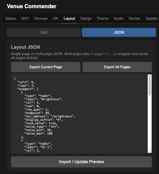
JSON mode lets you save and load layouts as text files:
- Export Current Page — downloads the active page's layout as a JSON file.
- Export All Pages — downloads all pages as a single multi-page JSON file (including any per-page PIN locks).
- Import / Update Preview — paste or edit JSON in the text area, then click to validate and preview.
Single-page format
{
  "cols": 6,
  "rows": 2,
  "widgets": [
    {
      "type": "fader",
      "label": "Ch 1",
      "osc_addr": "/ch/1/mix/fader",
      "col": 0, "row": 0,
      "col_span": 1, "row_span": 2,
      "endpoint": 0
    }
  ]
}
Multi-page format
{
  "pages": [
    {
      "page": 0,
      "name": "Main",
      "cols": 6,
      "rows": 2,
      "widgets": [...]
    },
    {
      "page": 1,
      "name": "Engineer",
      "cols": 4,
      "rows": 3,
      "pin_lock": {
        "timeout_min": 30,
        "pins": ["1234", "9999"]
      },
      "widgets": [...]
    }
  ]
}
The pin_lock block is optional on each page. An empty "pins": [] clears any existing PINs. Leaving pin_lock out entirely leaves existing PIN settings unchanged on import.